Macro photography editing tutorial: Ladybug on a finger
Matthew James Oxlade
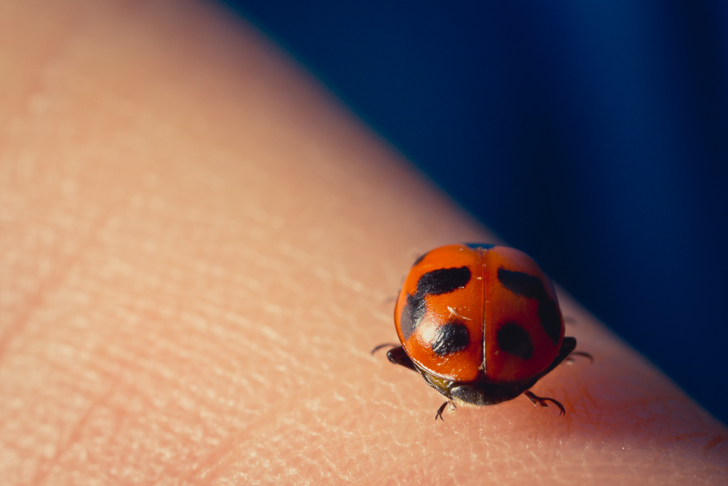
In this macro photography tutorial I’ll show you how I edited a photo of a ladybug on a finger.
Let’s go through how we can bring out some simple colours in an image I shot of a ladybug (or ladybeetle, depending on your preference) sitting on my girlfriend’s finger. This macro photography editing tutorial will show you how to use individual RGB tones alongside some more basic steps for enhancing colour and sharpening details.
Introduction to this Macro photography editing tutorial
Let’s go through how we can bring out some simple colours in an image I shot of a ladybug (or ladybeetle, depending on your preference) sitting on my girlfriend’s finger. This tutorial will show you how to use individual RGB tones alongside some more basic steps for enhancing colour and sharpening details.
Exposure and Contrast
I boosted the exposure slightly to bring some of the background colour out. That’s a beautiful blue and I don’t want to miss out on showcasing it. We’ll come to that a little later.
I could increase the shadows slightly to increase the brightness of the background, but that would leave my image without the depth that it currently has. By increasing the exposure, I was able to keep the balance between the brightness of the foreground and the deeper shadows of the background.
After increasing the brightness, I found that it still didn’t look like it had the depth I wanted. I increased the contrast to +14 to give it that little extra punch I felt it needed.
Tone
I left these settings almost as-is. Because I worked with the contrast earlier, the image doesn’t need much work balancing out the tones. If I were to have changed these, the shadows underneath the right side of the bug might have become too weak or harsh (or one of many other things). Sometimes you’ll need to adjust these, and other times (like this time), you won’t need to.
Presence
With macro photography, I find it’s important to boost the clarity somewhat to bring out some of the finer details. vibrance and saturation are somewhat different in terms of when you might need to use them.
Vibrance and saturation were increased slightly in this image to boost the colours subtly without becoming unnatural. The areas I wanted to enhance as part of this process was the skin tones of the finger, the blue background and the orange on the bug.
Tone Curve
Rather than just moving the tonal curve to increase or decrease the contrast in certain areas, I selected the dropdown box to allow me to adjust the curve differently for each colour in the RGB spectrum.
Because there’s a lot of skin in the image, I increased the darker tones of the image on the red channel and offset that difference with a decrease in the highlights due to the brightness of the skin in the bottom left corner.
Saturation and Luminance
The difference between the saturation sliders here and the Lightroom sliders at the top is that in this section you can alter the saturation levels of colours individually. This is perfect for this image because the main areas I want to enhance are the blues in the background and the orange on the ladybeetle’s wings.
If we didn’t use these sliders to increase the saturation for the individual colours and used the overall sliders as a whole, the skin tones would become too saturated and look unnatural.
I used the picker to select the orange on the beetle and the lighter area of blue in the background and slid the mouse upwards. I didn’t think the colour looked right, so I shifted to the luminance to darken the colour that we saturated.
The luminance sliders work the same as the saturation sliders, but the brighten or darken that colour. If you want a rich colour, slide it down towards the black, paying attention to how it darkens that area of the image. I didn’t want to lose the impact of the beetle’s bright orange on the skin or how it popped against the blue background, so I left it at 0 on the blue channel and increased the blue slightly to bring out some of it’s colour. This made it a little less muddy in the background and helped separate the colour.
Split Toning
The image looked a little lifeless still and needed some extra colour, so I used the split toning panel to tint the highlights and shadows differently.
Doing this is mostly trial and error, but over time you start to understand what influences the colours in the best ways, and you’ll begin to have an idea of what you’re searching for before you even start.
For the highlights, I chose a very light purple with a very low saturation point. I didn’t want it to overpower the skin tones, especially on the far lower left, but I wanted it to affect the top right beams of light and add a small bump of colour to the skin tone to make it more natural.
It looked a little too high in the magenta side, so I used a super faint green tone with an even lower saturation point to return some of the greens to the darkest section of the shadows. I think this made it look more natural.
Sharpening
Sharpening your image in macro photography is crucial. You need to ensure that the small details are enhanced as much as possible because that’s the whole point of macro photography!
It can be hard to tell how much sharpening is required and where it is being applied most. Holding the OPTION key on a Mac and moving the Masking slider up will turn the image black and white, with the white parts being the areas that the sharpening will apply to. This won’t increase the level of sharpening – that sticks with the Amount slider. But the Masking slider will show you the areas it will be applied to.
Increasing the Radius slider will increase the area size that the sharpening is applied to. Think of this like tracing – you want enough detail to come through, but not too much detail that it’s hard to tell what the subject of the image is.
Cropping
Sometimes I do this step first, but for this example, I did it last. At first, I thought I wanted the entire frame, but as I edited I felt I wanted a closer crop. Hit the ‘R’ key to bring up the crop, and by default, it will be selected to the ratio of the format the image was shot in, so you don’t need to worry about getting the measurements right.
When cropping the image I used the rule of thirds to place the ladybeetle on the lower right section. That’s a known rule in composition, but it doesn’t always work. Check out my composition section for more information about why this rule works and when it’s best to break it.
I wanted the ladybeetle to sit fairly even and use the line in the background to give the image an attractive edge. Holding the OPTION key down while in the cropping mode will allow you to straighten the image in small increments to get the level right. Almost every image needs to be straightened, so always spend the time getting the balance right.
Final touches
I returned to the different levels of the red and blue channels to increase the lower tones slightly because I felt they lacked punch. Sometimes you get to the end of the process and realise one or two things need to be changed. In this case, I followed the same process I outlined in the tone curve section of this guide, so return to that section if you’re unsure what I’m doing at the end of this macro photography editing tutorial video.
Summary
What we’ve done is:
- Increased the white balance and offset it with some pink tint.
- Increased the contrast and exposure to brighten the image and maintain impact.
- Kept the edges dynamic and boosted colours slightly.
- Adjusted the tone curve on individual channels to influence the tonal range of certain colours.
- Adjusted the luminance and saturation of certain colours to manipulate certain areas of the image.
- Applied split toning to the highlights and shadows to add vibrance to the image as a whole.
- Sharpened specific areas of the image to keep the beetle’s details.
- Cropped and straightened the image.